Arts & Letters
Arts & Letters for Great Minds

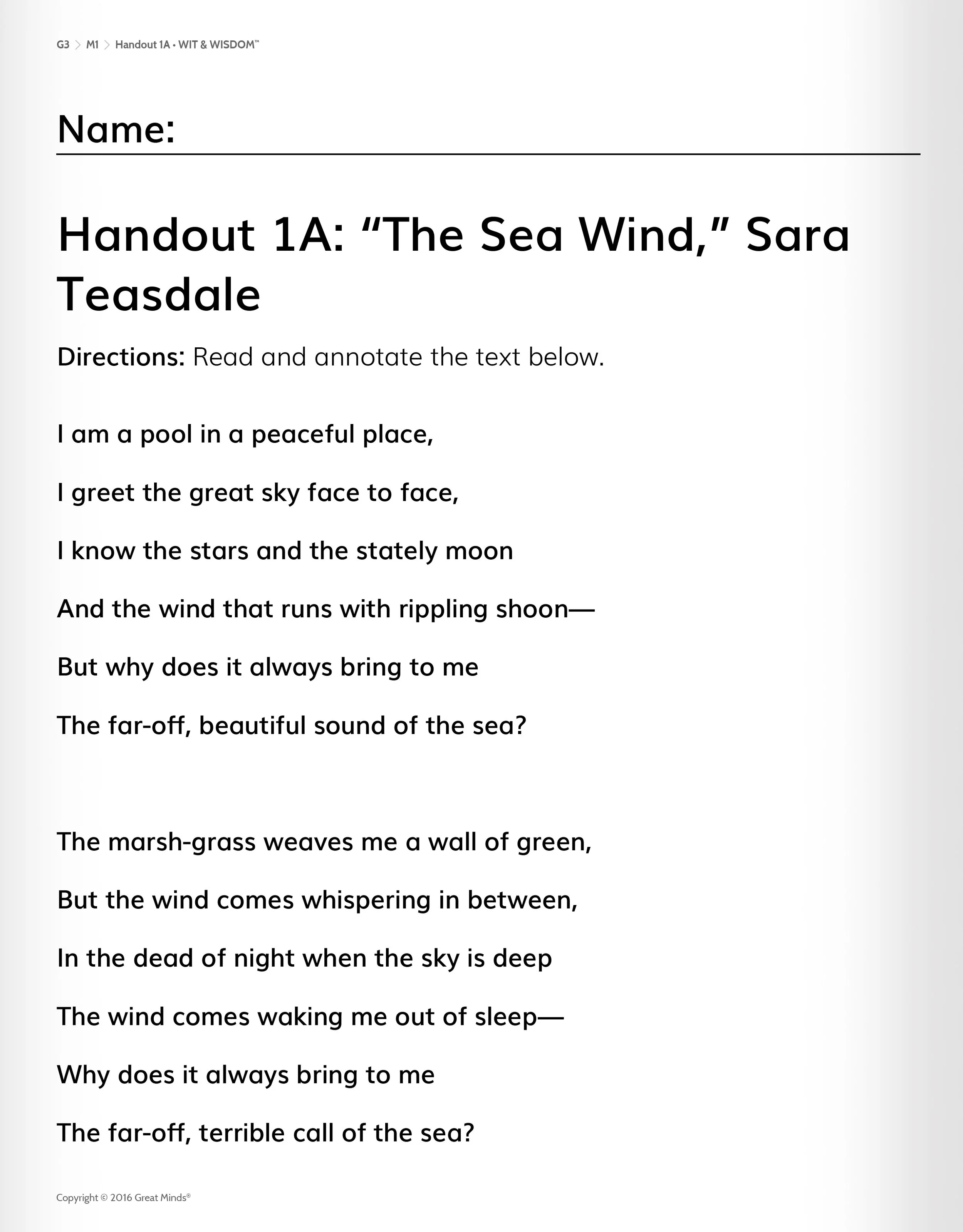
Teach, Learn, and Prologue books for Arts & Letters Grade 1 Module 1
After completing Levels K-2 of Geodes, we turned our attention to a new English Language Arts (ELA) offering that was in development. Like its predecessor, Wit & Wisdom, Arts & Letters uses trade books, fine art, newspaper articles, and historical accounts to build knowledge of language arts through deep exploration of a topic. Arts & Letters covers grades K-8, a total of 36 modules, spanning topics from Civil Rights history, to baseball, to Shakespeare.
We were part of the discovery and prototyping process, which allowed us to pinpoint design changes that were needed when looking at Wit & Wisdom. I created the initial prototypes in collaboration with Product and Content leadership, and subsequently lead a team of 4 designers as they designed the iterative pieces of the program.
Visual Way-finding in Arts & Letters
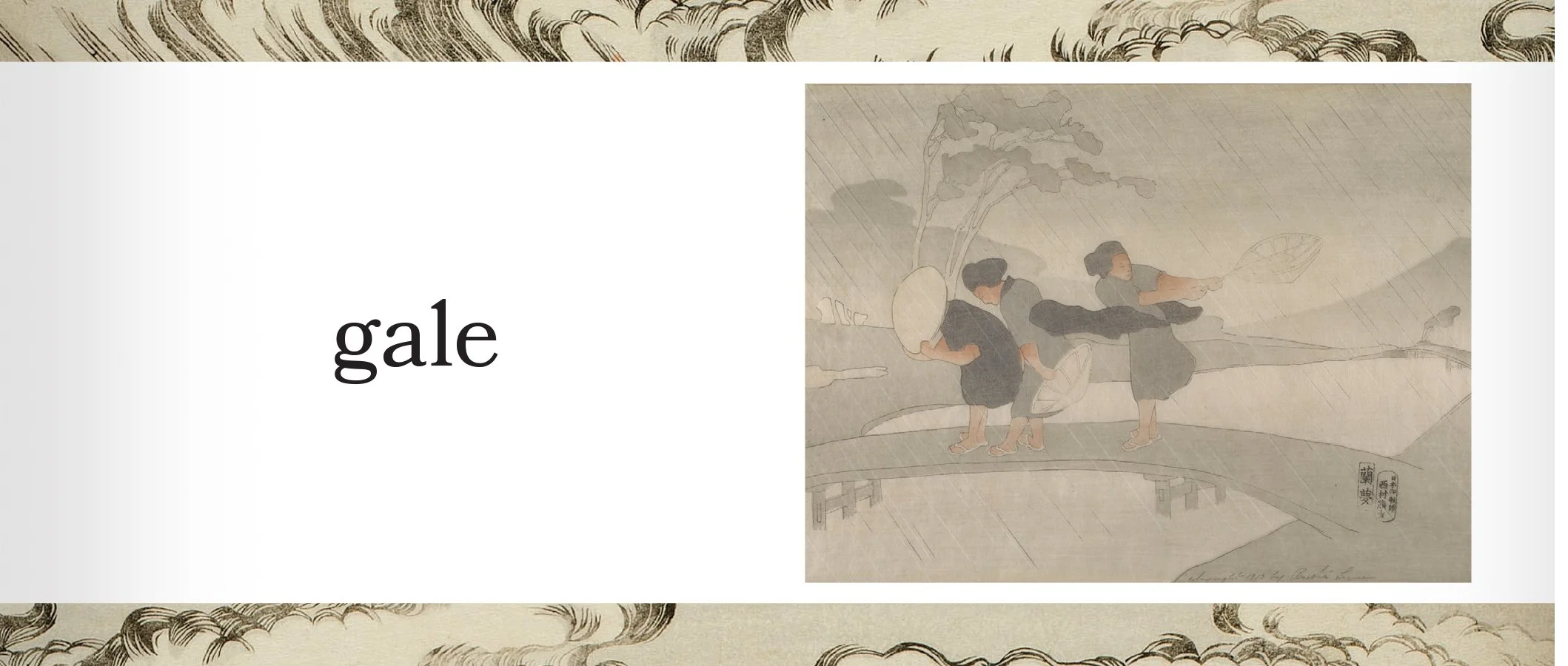
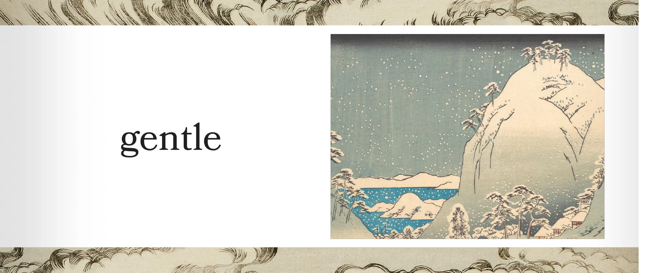
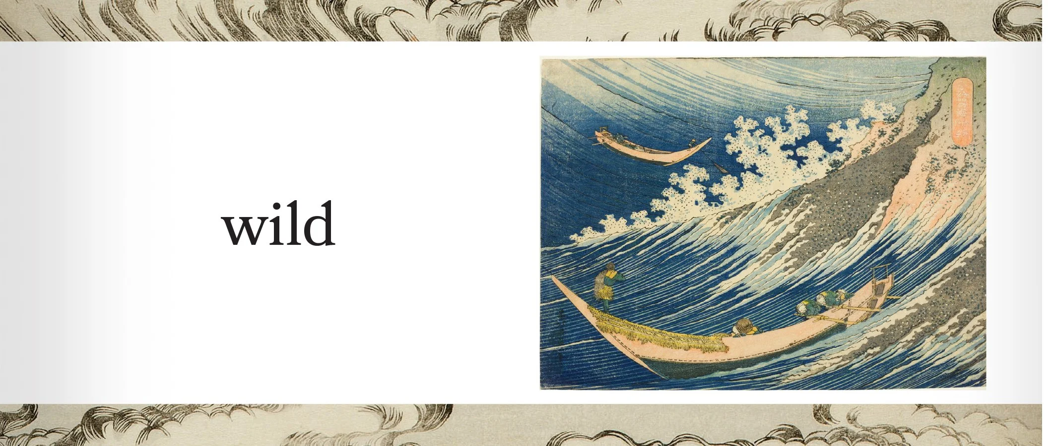
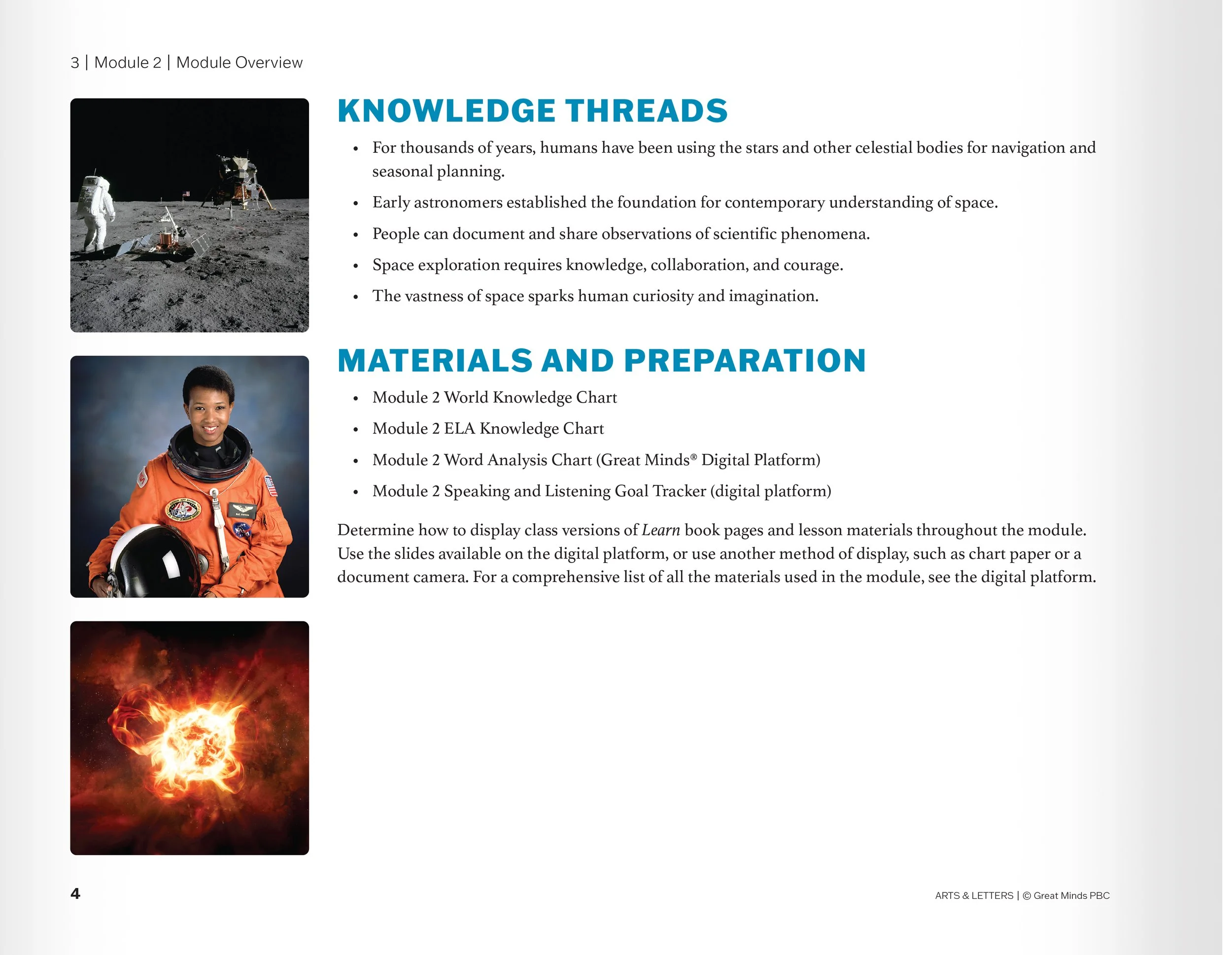
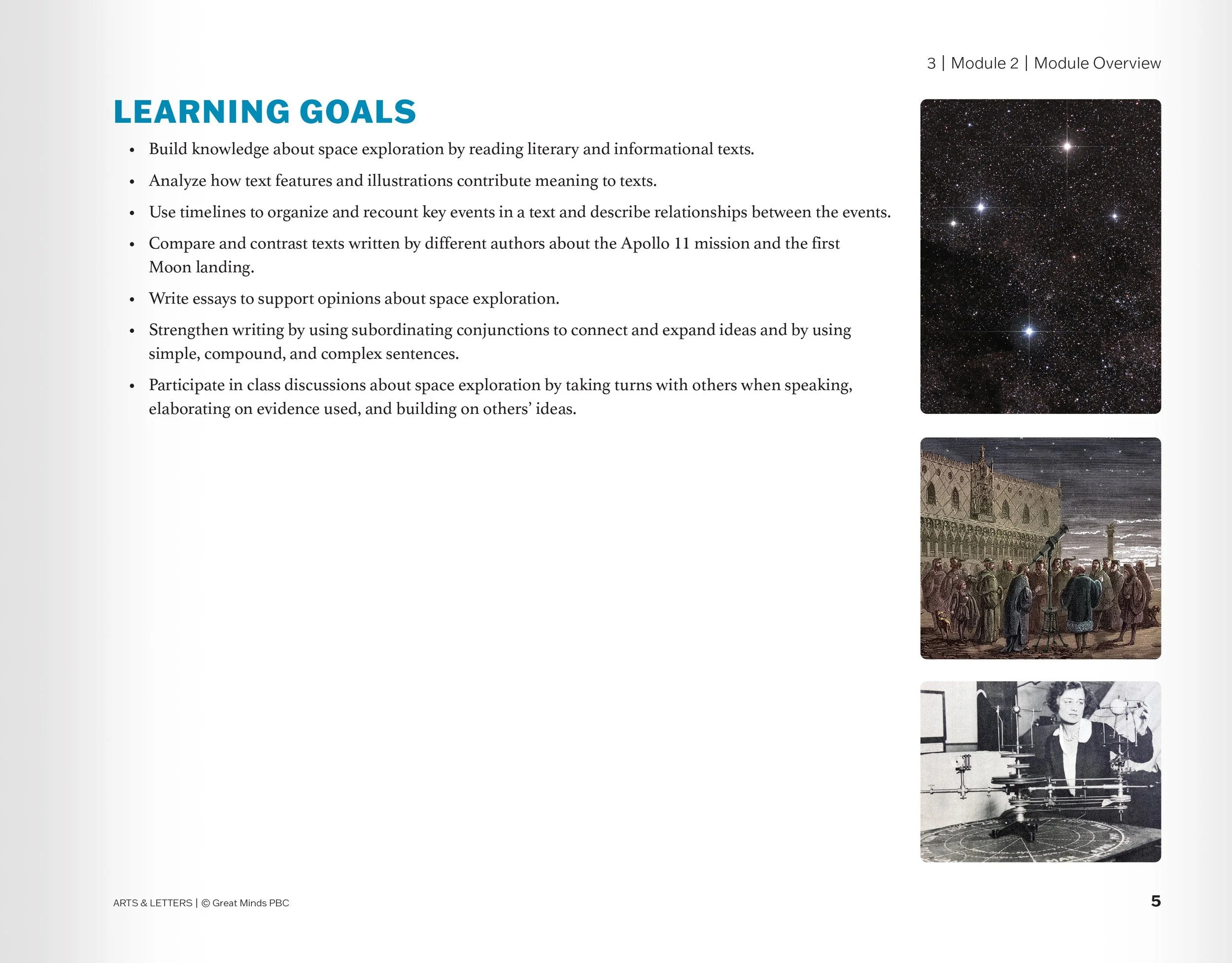
We had the privilege of ensuring that materials were unique to the content being covered in each module and thoughtfully created. I devised a visual way-finding system for the program: Each module had a thematic element (e.g. Japanese block prints, NASA photographs, illustrations that looked like illuminated manuscripts). This carried through in both student and teacher materials. The specific image changed depending on which text was being studied.


Before and After: Wit & Wisdom teacher edition vs. Arts & Letters Teach


We knew we wanted to begin to visually link our ELA products to our Math products, as well as our brand as a whole. We did this through the covers of our teacher and student workbooks, as well as some interior visual conventions.
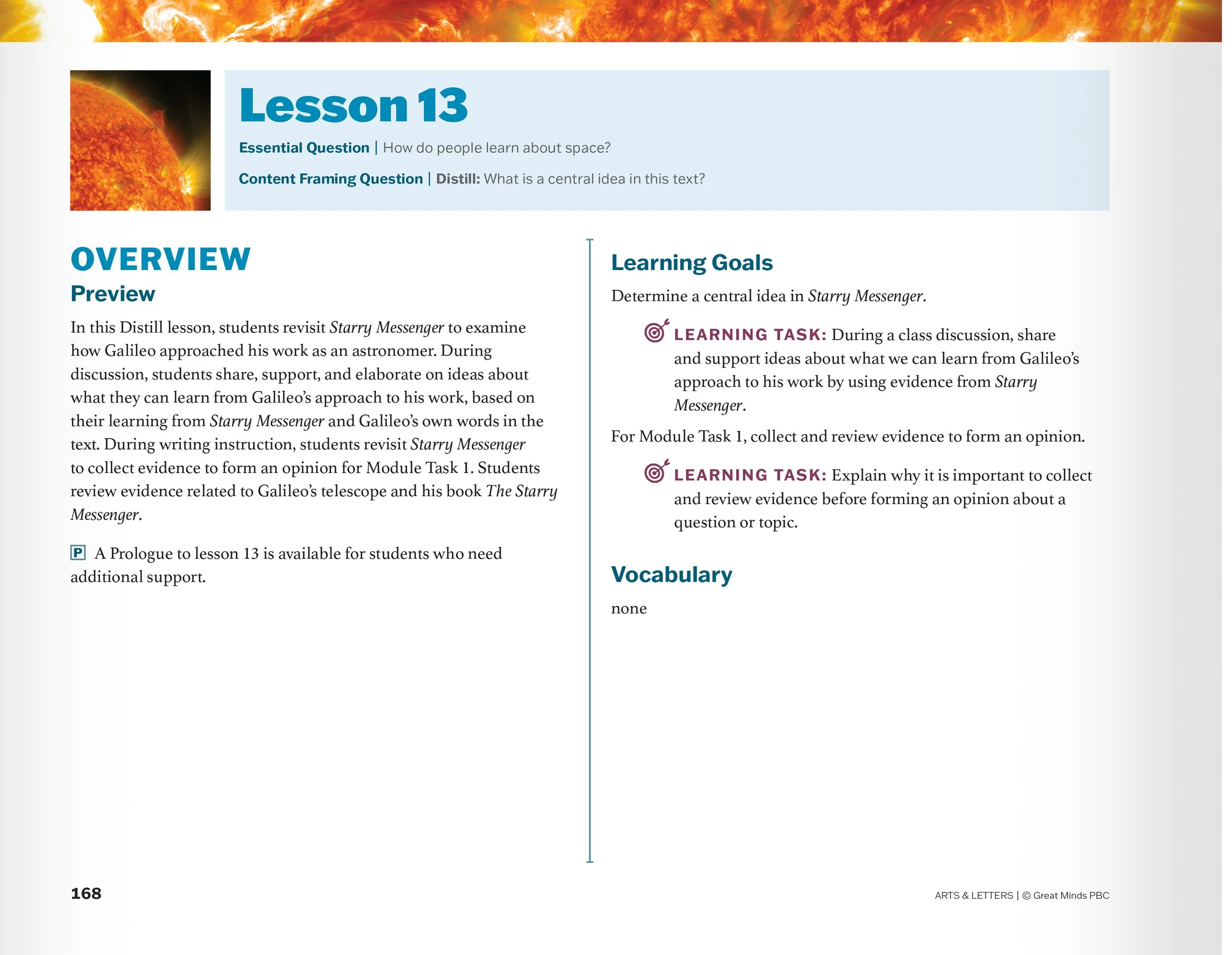
We sought to engage teachers in each module’s topic from the beginning, so we created front matter that was driven by visuals.
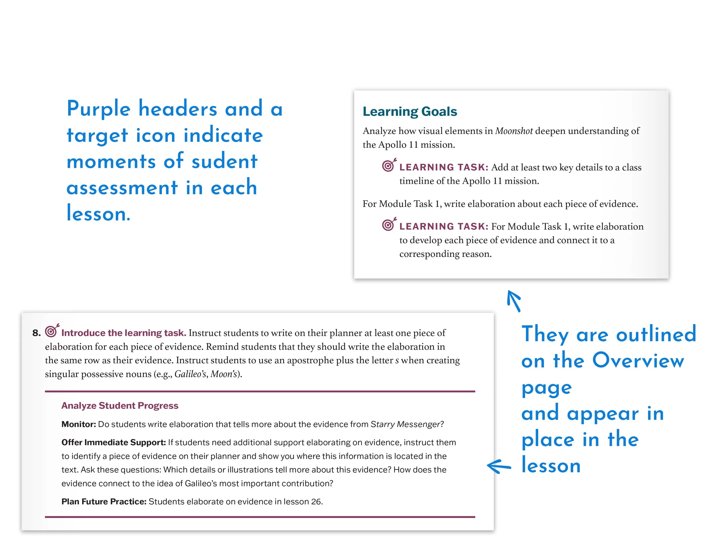
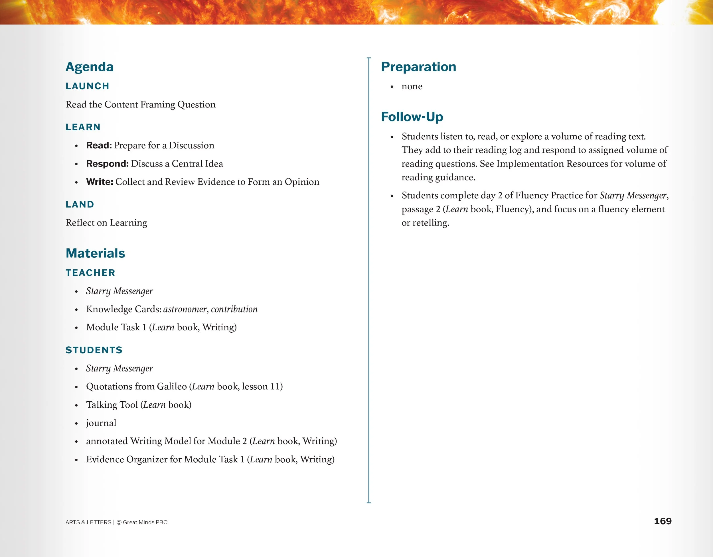
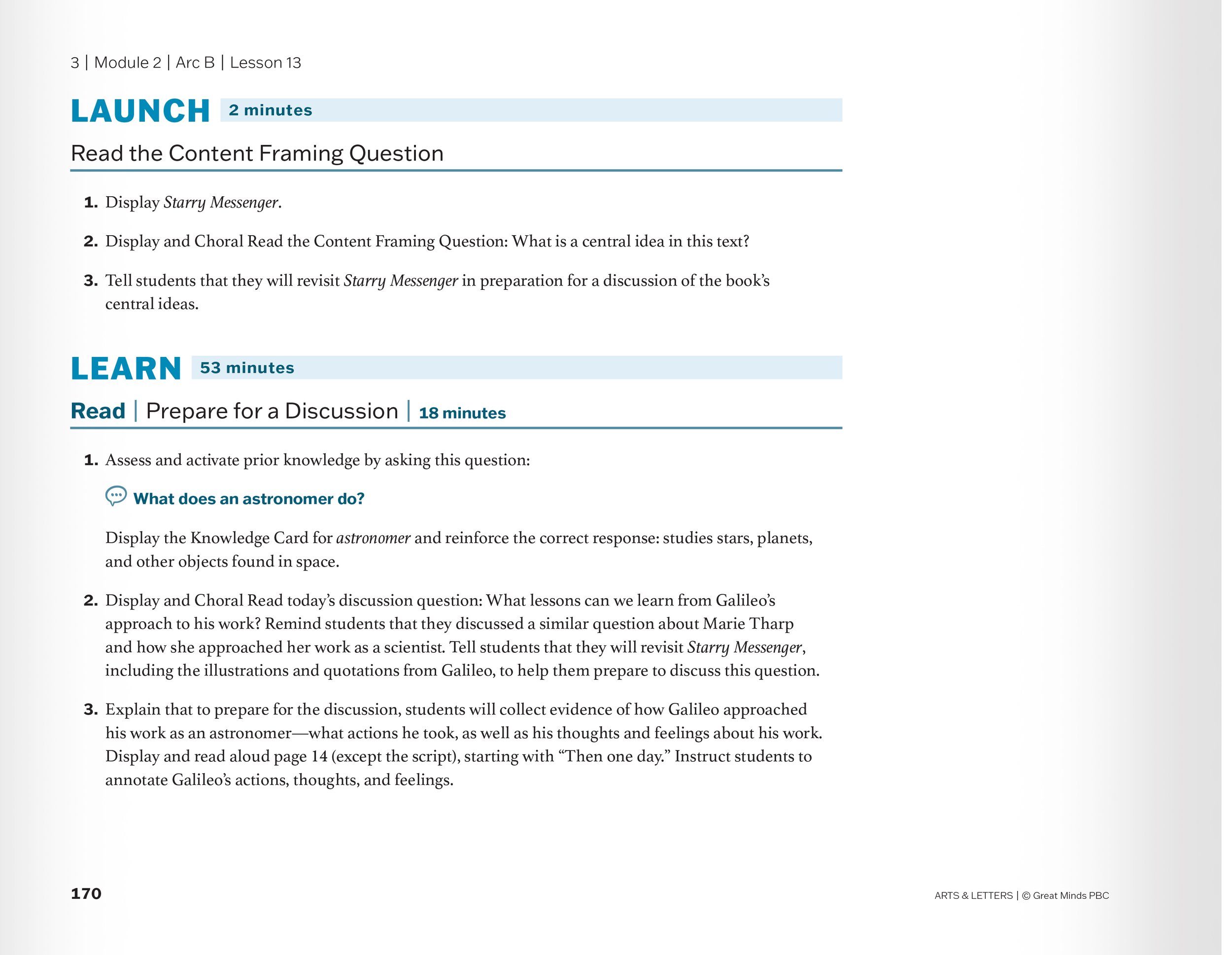
Lessons needed to be more skimmable, and teacher choice vs. scripting of the lesson needed to be very clear. We supported this through numbering, sidebar notes, and using icons as cues.
Prologue was created specifically to support students with learning disabilities and who are learning English. Prologue followed the visual structure for the product, but featured a distinct cover.


Before and After: Wit & Wisdom student edition vs. Arts & Letters Learn

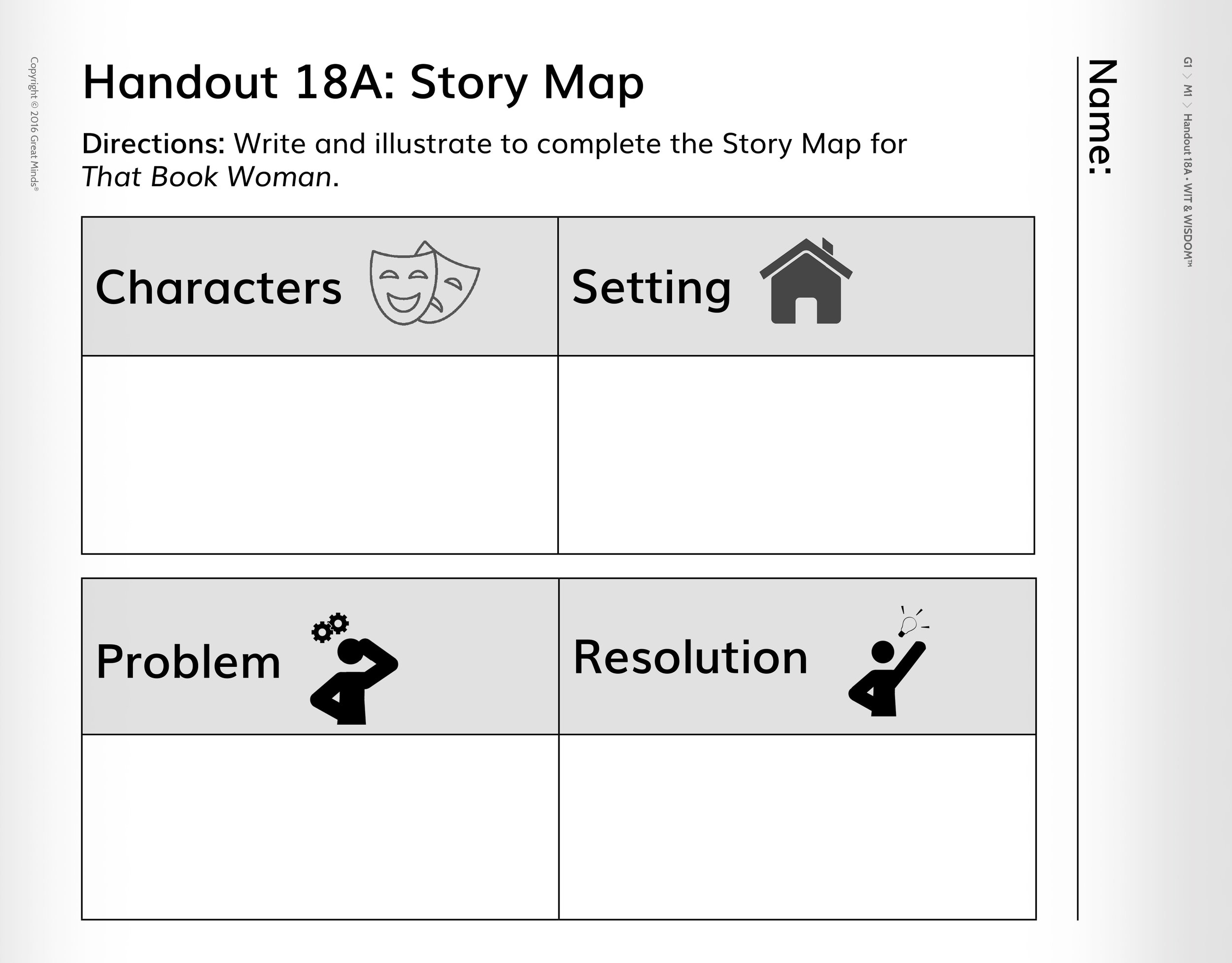


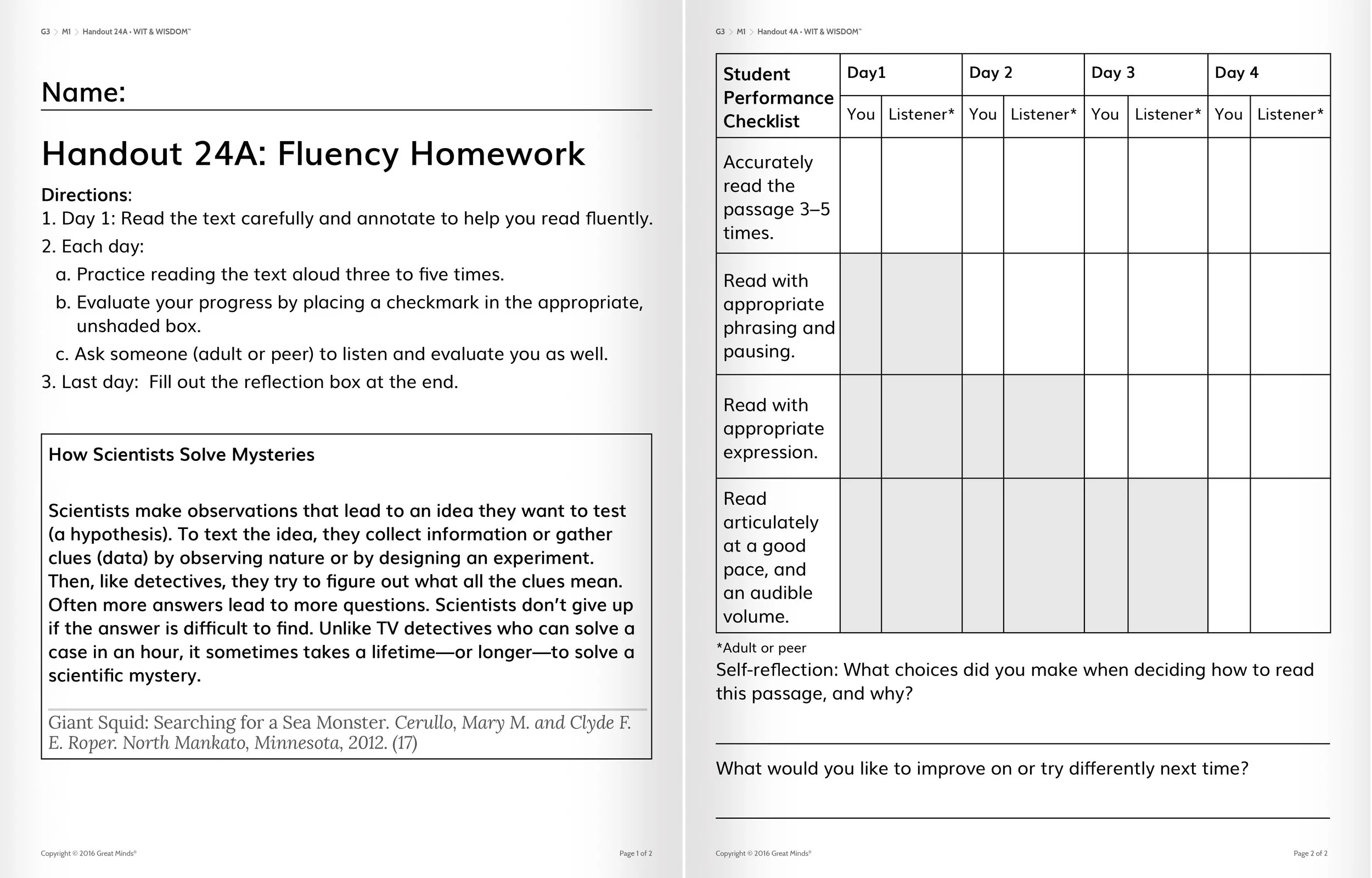


We knew we needed more engaging student workbooks, with more room for writing. We assessed what size student writing may be at different ages and looked at what text should be read by them vs. a teacher. Great Minds’ previous student materials did not make the most practical use of space or emphasize the right things. We reassessed and redesigned.


Previously, supplemental texts, like articles and poems from newspapers, magazines, and literary collections were listed as links in our digital teacher materials or included in plain text. Plenty of user feedback told us these needed to be accessed at point of use and distinct from the workbook itself. We brought them into our materials and on to the platform, giving them a unique look to differentiate from Great Minds’ content.
Arts & Letters also added video content to the curriculum, both for students and teachers. My team created the storyboards for video content, ensuring that the visuals were packed with knowledge and additional context. They provided feedback on how everything looked at the rough cut through to final. The Learn book included a gallery of images from the videos to support student recall.
The Knowledge Deck
The design team provided images for our vocabulary cards, looking for ways in weave the visual throughline of each module into images in the deck itself. For example, in Grade 1 Module 3 – Wind Power, the visuals were rooted in Japanese woodblock art, and the vocabulary cards carried this through.